Visual Editing - User Guide
This guide introduces the Visual Edit system and shows you how to edit content and build pages directly on your NationBuilder site.
Visual editing lets you update a website while looking at the page itself. You can see how text and images fit within the finished layout as you work. Visual building brings the same approach to page structure, letting you add and arrange sections in place.
This guide introduces our NationBuilder tools: Visual Edit for content and Visual Builder for page structure. Depending on the page, you may have either tool or both.
#Visual editing
Visual Edit puts editing controls alongside the content on NationBuilder pages and modules.
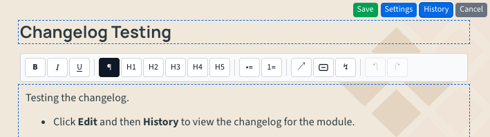
When you are signed in as an administrator, hover over an editable area. Editable areas will show with a border and an Edit button. Click Edit to enter Edit Mode to start editing content.
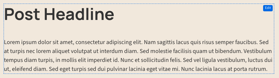
Make your changes, then select Save to keep them or Cancel to leave the original content in place. Finish one edit before starting another. The available fields and options depend on the page or module.
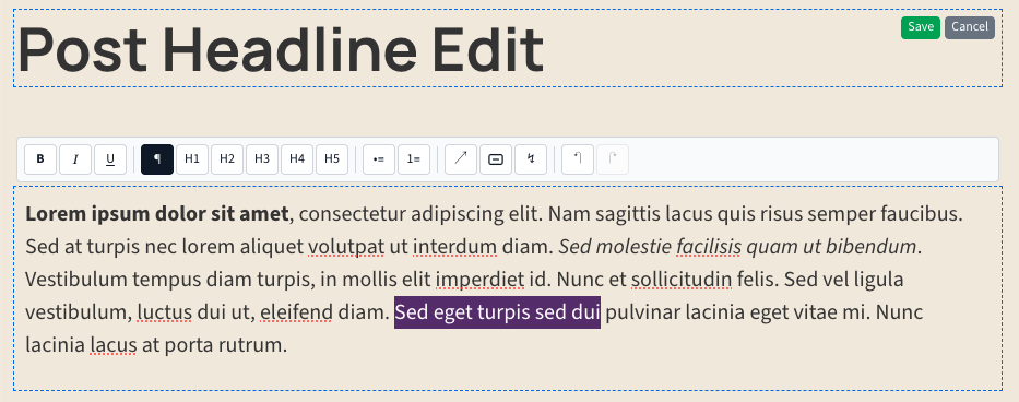
Edit text and images
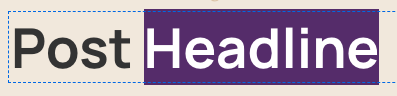
Select a text field with a border to update a heading or other short copy.
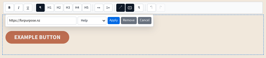
Longer content can offer a rich-text toolbar with bold, italic and underline, headings, lists, links, and undo and redo.
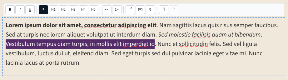
The toolbar also supports inserting custom snippets. For example a styled button can be inserted, with several styles to choose from.
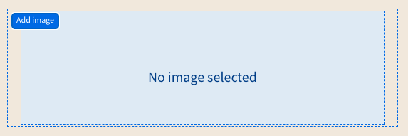
Some modules let you add or replace images. Click Add image or Replace to select the image. The picker accepts JPEG, PNG and WebP images up to 10 MB.
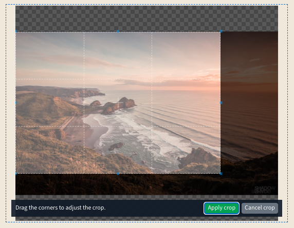
You can crop the image before uploading it. Adjust the crop, then select Apply crop.
You can also remove an image by clicking Remove.
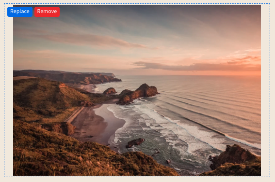
Your image changes take effect when you select the page or module's Save button.
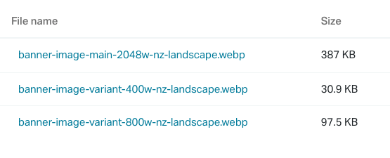
When configured, the tool uploads smaller versions alongside the main cropped image, helping the site serve a suitable image size on different screens.
Adjust settings
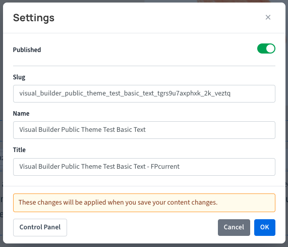
Some pages and modules offer a Settings dialog. Settings can include the page name, title or URL slug, plus choices that change a module's layout or content.
Click the Settings button after entering Edit Mode to see the options available for that content.
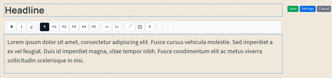
Depending on the module, you may see text fields, dropdowns or checkbox settings.
Related settings can be grouped into expandable sections. Open a section to work on its settings, or collapse it to focus on the others.
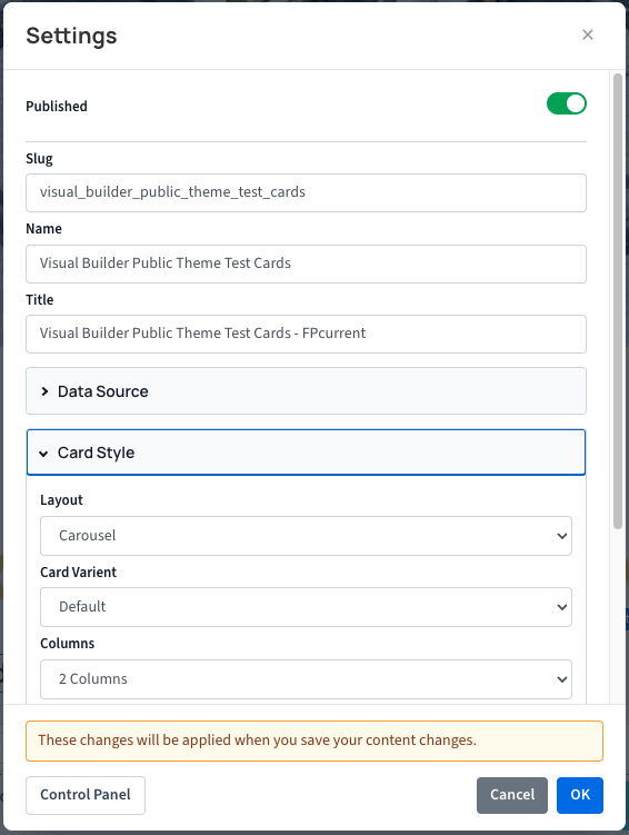
If shown, the Control Panel button at the bottom of Settings opens the page in NationBuilder's control panel in a new tab.
Select OK to stage ordinary setting changes, then select Save on the page to keep them. For settings that need a reload, Save and refresh saves your current content and settings changes together, then refreshes the page to show the result.
Publish a module
Where draft controls are enabled, a white Draft label marks a module that administrators can see and edit but visitors cannot.

A draft module has a green Publish button that publishes it immediately.
Use the Published switch in Settings to publish or unpublish a module. Select OK, then Save to keep the change.
Change Log: See what changed
If the Change Log feature is enabled, select Edit, then click the History button.
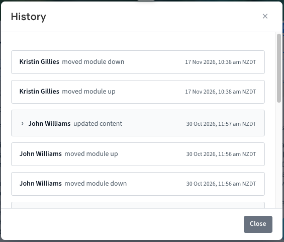
A dialog will open with a list of recorded changes. The newest entries appear first, with the editor's name, a summary and a time in your local timezone.
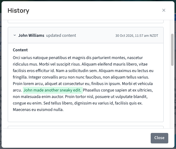
Open a History entry to inspect changes to text, settings, images or publication. Added and removed text is highlighted where available.
A site wide change log is also available that lists all pages in the site and each change. Note - this is still in development - an image will be updated once done
Visual building
Visual Builder lets you add sections such as a hero, text block or banner. Depending on the page, it can also manage blog posts or items within a module, such as an expandable list.
Add a module
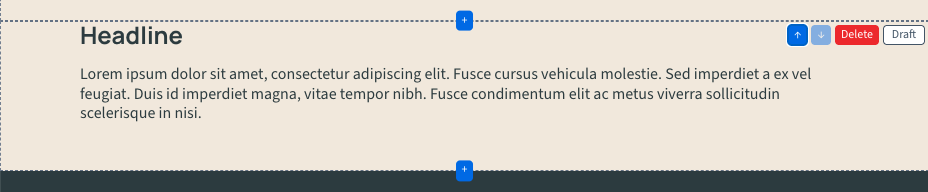
Hover over an empty module area, or move keyboard focus to it, to reveal the centred Add control (it appears as a + icon). On a page with ordered modules, Add controls appear above and below each module so you can choose where the new one goes.
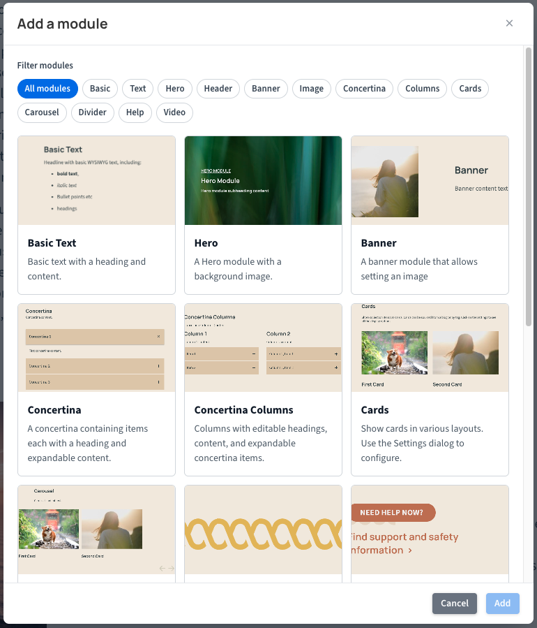
Click Add to open the Add a module picker when several module types are available. The picker shows module names and any configured descriptions or preview images. Use category filters when available to narrow the choices, select a type, then select Add to confirm. When only one type is available, clicking Add creates it directly.
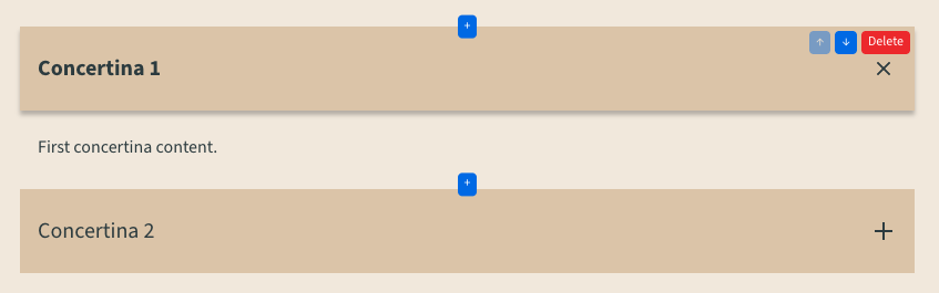
Visual Builder can also manage items inside a module. For example, you can add and move items within a Concertina module.
Arrange or remove modules
In an ordered area, use Up and Down to move a module one place at a time. The page updates without reloading.

To delete a module, click Delete. A confirmation dialog will appear; confirming permanently removes the module and cannot be undone. Add, move and delete actions save as you use them, without a separate page Save step.